You've obviously heard "never judge a book by its cover." But it doesn't matter. We all do it anyway. There are dozens of times I added books to my Goodreads "Want to Read" list because they sounded amazing. Then the cover art was added and I thought, "yeaaaa....no. Never mind."
We're all guilty of it. It's human nature... we're just not going to pick up something if it's not visually appealing.
Sometimes book covers are outdated and need to be refreshed, sometimes the cover artist put ZERO effort into coming up with something decent, and sometimes it's just plain UGLY.
It's also worth mentioning that we shouldn't hold it against the author if their books look lame... they usually have no say in cover design or what the finished product looks like. But that doesn't mean they still didn't pour their blood, sweat, and tears into creating an amazing book, so let's give them the benefit of the doubt. Because the sad part is, we usually end up missing out on some pretty entertaining stuff.
Like the books themselves though, cover art is completely subjective.
Some people might love what I hate and vice versa. But here are some
that I think really take the cake. Disagree? Bring it on in the
comments, haters.
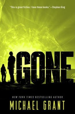
1. Gone by Michael Grant
Something about two cover art models looking off into the distance just doesn't strike fear into my heart the way this book is supposed to. I mean, it's not the worst I've ever seen. But I think the paperback reprint is a much better pull.
2. Return to Paradise by Simone Elkeles
This is just bad Photoshop. Plain and simple.
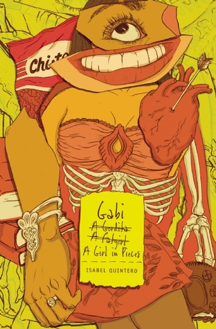
3. Gabi, A Girl in Pieces by Isabel Quintero
Let me show my age a moment and tell you that we had books with better covers than this in the 90's. This cover just screams, "I LOOK OLD AND DATED AND COMPLETELY NOT WORTH PICKING UP DON'T LOOK AT ME." This book, however, came out in 2014, not 1996. It also won the
Printz Award, which should tell you something about it's quality. (Hint: It's GOOD.)
4. Vampire Academy by Richelle Mead
Did no one question why there's an Angelina Jolie look-alike happening here? I think I also have an issue with cover models in corny poses. She's supposed to look sultry and seductive and vampirey. Instead I just see... well, Angelina Jolie. And she looks like she wants to rip off my face and eat it for a snack.
5. Where Things Come Back by John Corey Whaley
This book won the Printz Award in 2012. There's no excuse why this book should have this cover. Literally anything would've been better than this. Fortunately, the paperback edition is a darn good upgrade.
6. City of Bones by Cassandra Clare
For a book series that I feel HARD in love with, this cover just gives me a headache. It looks like some really awkward bodice-ripper Harlequin romance. Yes, this series has romance, but not THAT kind of romance.
7. Gingerbread by Rachel Cohn
This is one of those covers that kind of made sense at the time, but still not really. Gingerbread was released in 2003 (which holy crap was 15 years ago... were you even born yet?!), and giant gothy-style platform shoes were a thing. While I never sported this look myself, I do remember it quite well and it was pretty awkward, even for 2003.
8. Passion by Lauren Kate
WHY DO HER ARMS LOOK LIKE THAT?!


No comments:
Post a Comment